Palette
A restrained palette applied with intention, avoiding decorative excess.
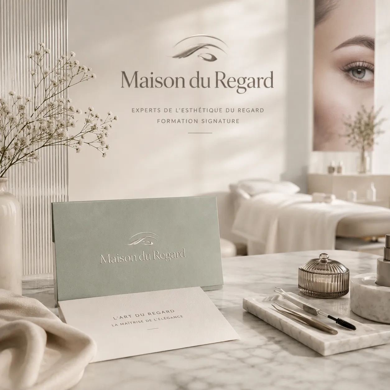
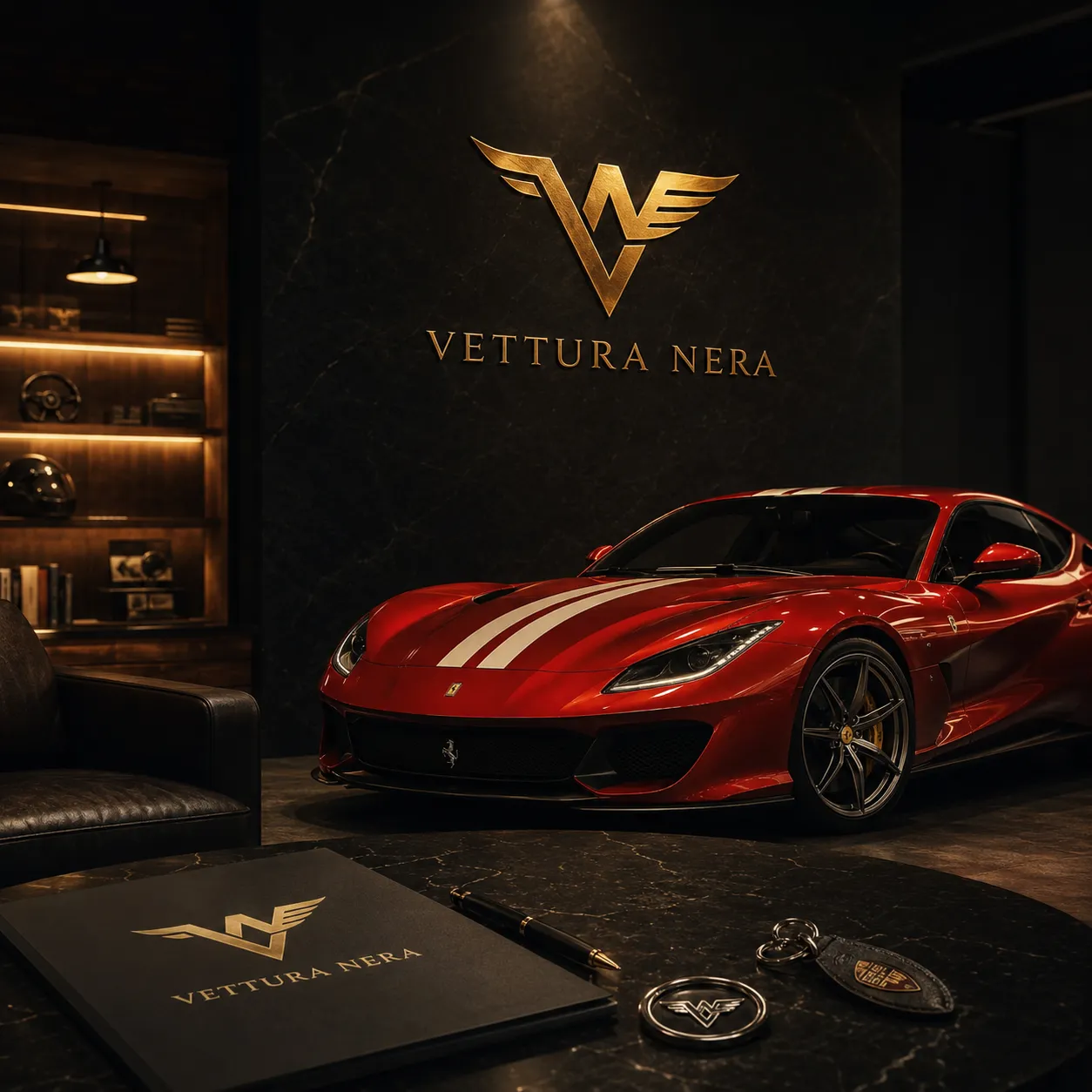
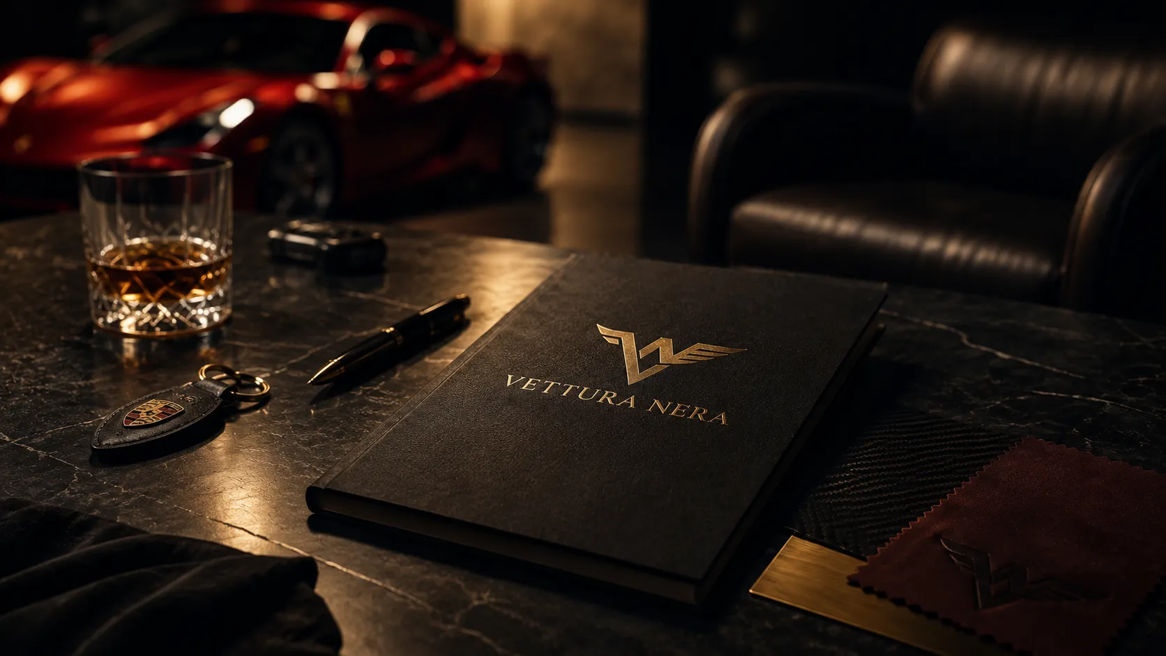
Automotive · Luxury · Creative Direction
Visual precision for a premium automotive universe.
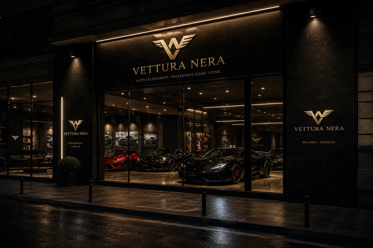
A restrained visual system for a luxury car dealership, focused on trust, exclusivity, detail and a more editorial approach to premium automotive communication.
01
Challenge
The project needed to avoid automotive clichés and build a more sophisticated presence, able to communicate value without visual excess.
Intention
The intention was to create a sober, precise and premium visual language, where materials, typography and imagery communicate confidence and exclusivity.
02
03
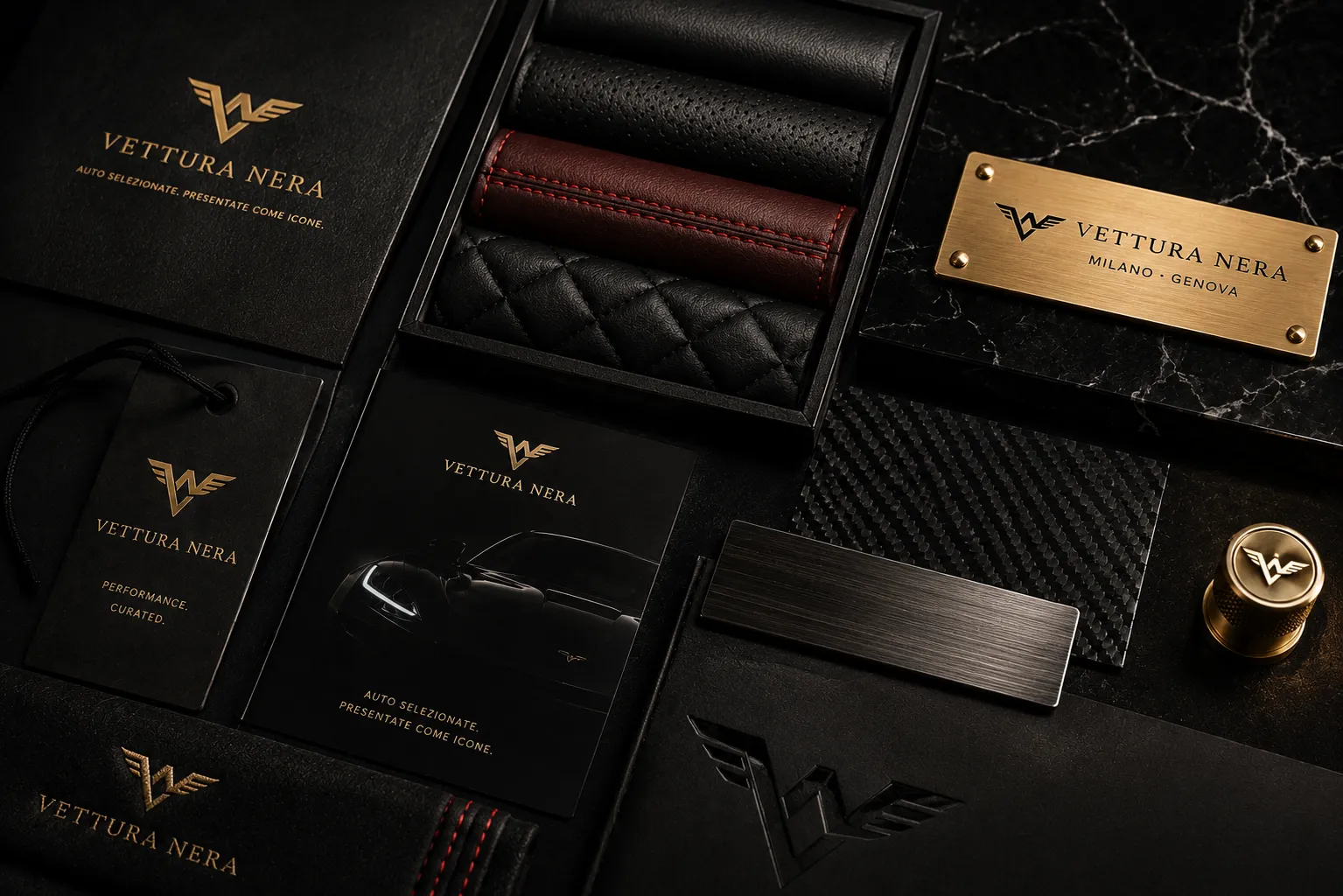
A restrained palette applied with intention, avoiding decorative excess.
Clear hierarchy, strong titles and simple reading across every format.
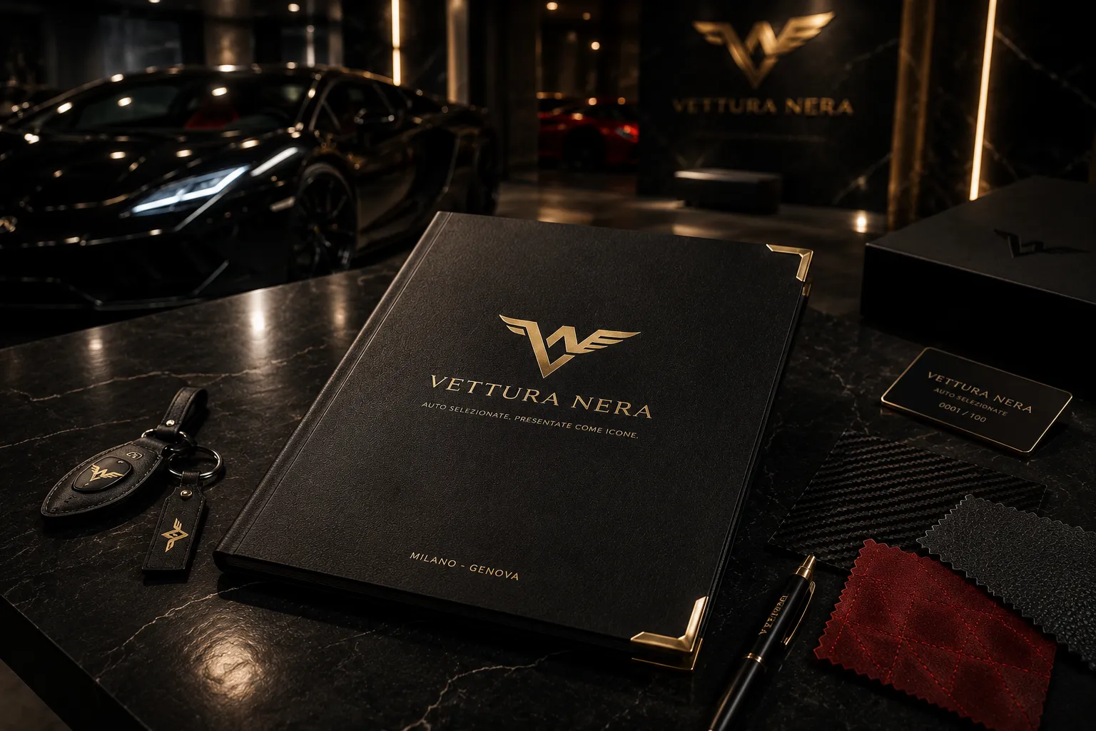
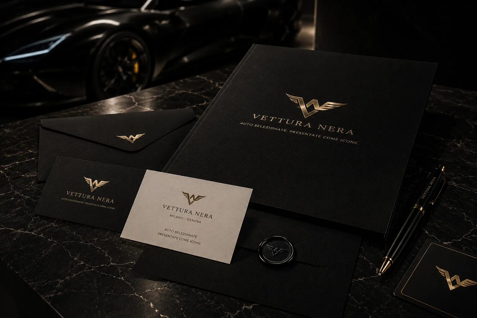
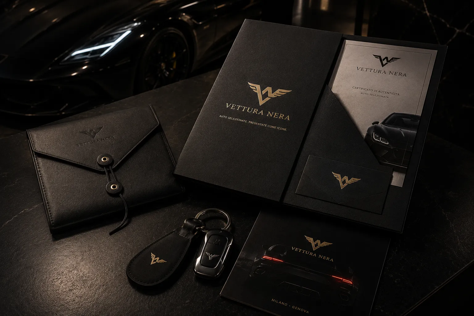
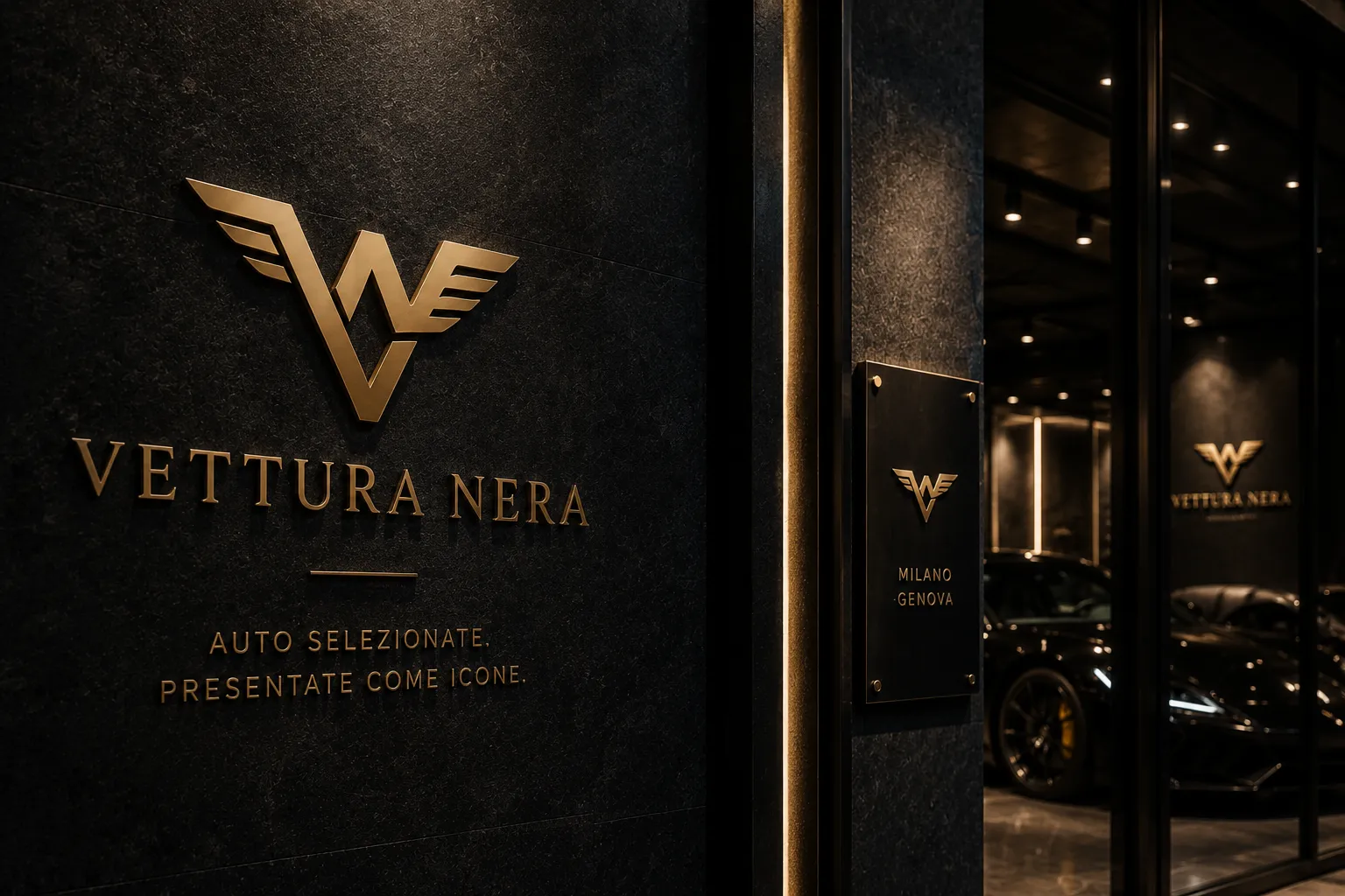
A visual element treated as part of a system, not as an isolated mark.
Subtle details that create atmosphere without compromising clarity.
Controlled repetition to create continuity and recognition.
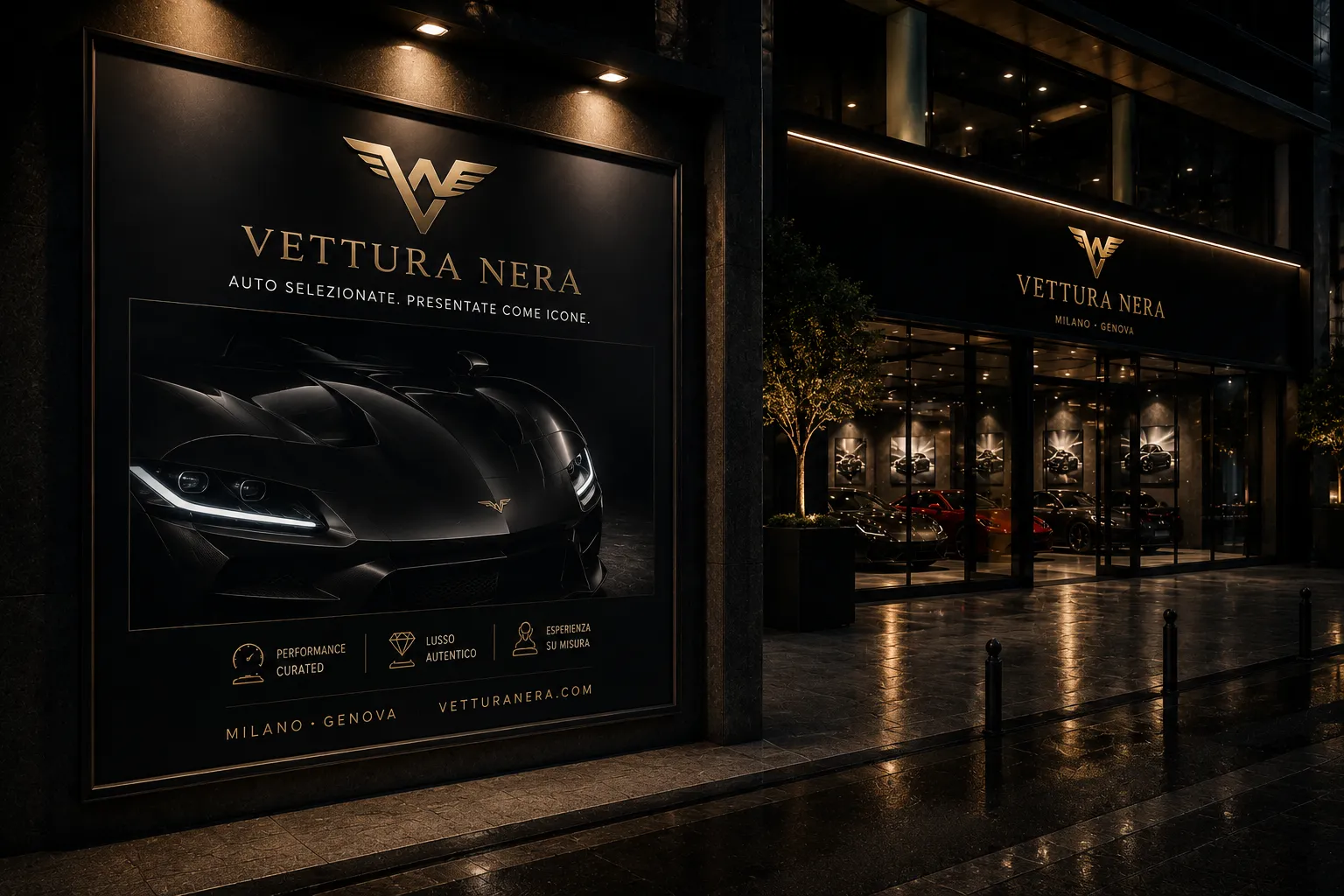
Images with space, contrast and editorial coherence.
04
05
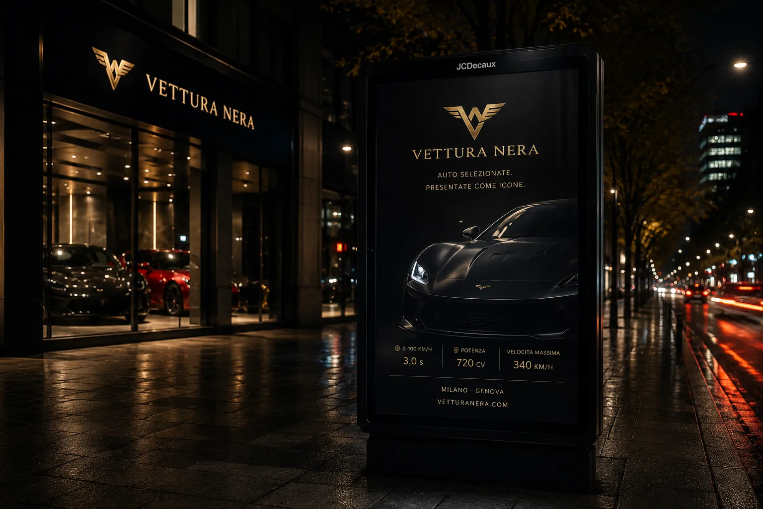
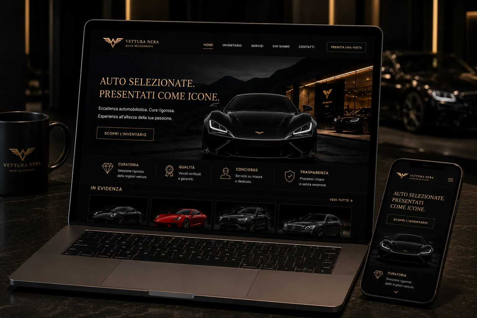
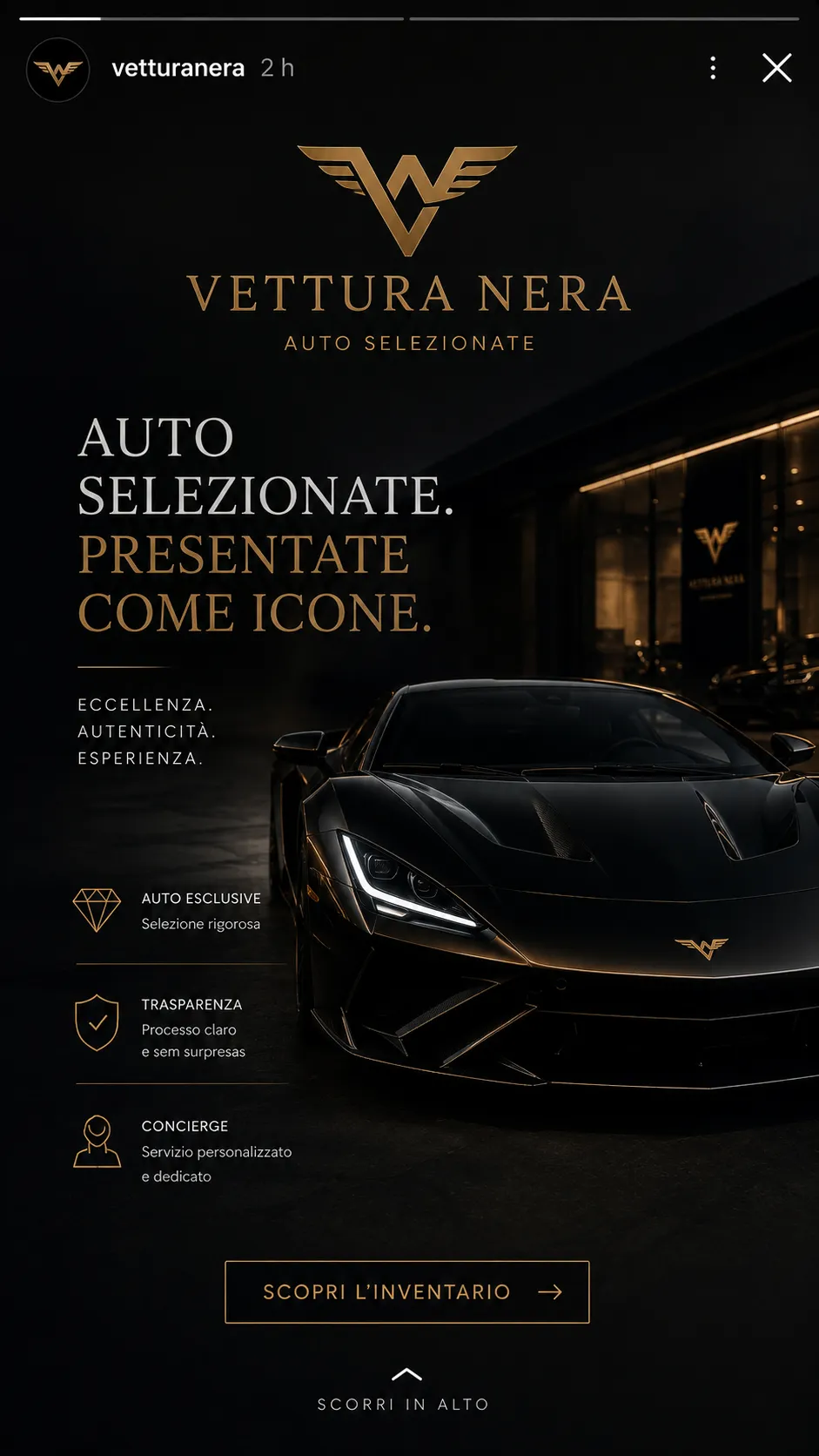
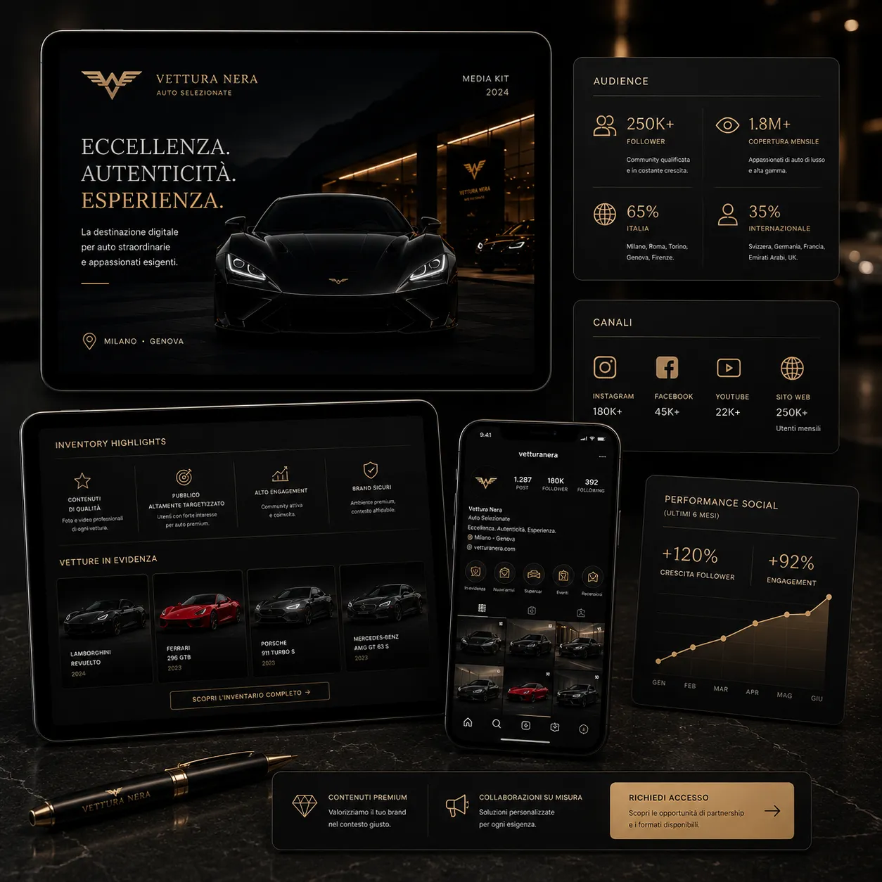
The digital applications translate the visual system into responsive brand touchpoints, from website presence to mobile and social media formats.
06
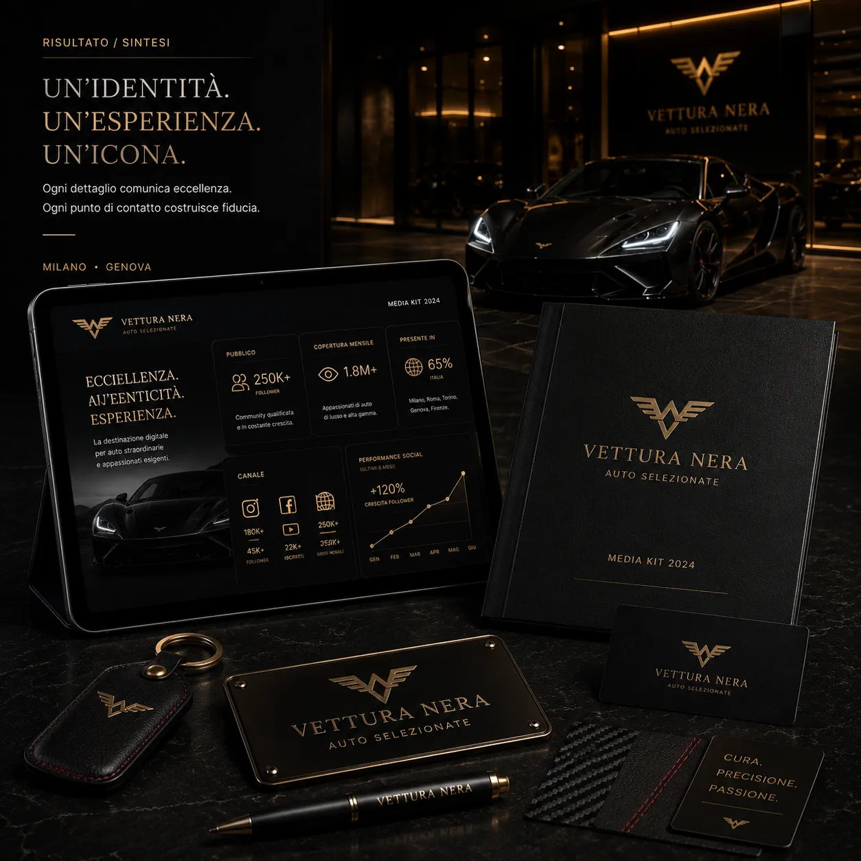
The result is a more mature visual system with a consistent brand presence across print, physical environment and digital communication.
Share the context and I will reply with objective next steps to structure identity, direction and digital presence.